


27 april 2026
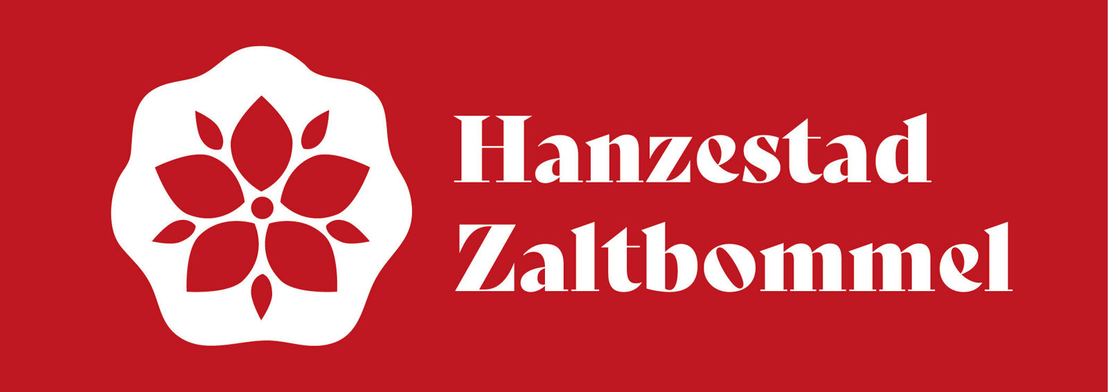
First, the colour. The deep red is no coincidental choice. During the Hanseatic era, only ships affiliated with the Hanseatic League were permitted to fly a red pennant on their vessel. That red colour was a sign of membership and standing, visible to everyone on the river. A ship with a red pennant was known to be trustworthy, it belonged, it was part of things. That meaning is still carried by the red in the logo of Hanseatic City Zaltbommel.
Then the medlar in the middle. The medlar flower is inextricably linked to Zaltbommel and its history. For centuries, three medlar flowers have featured prominently in the official city coat of arms. The medlar was once a common part of the landscape and daily life here, and has since grown into one of the most recognisable symbols of the city.
In the logo, those two stories come together: the city and the Hanse, the local and the international, the past and the present. United in an image that from now on can be seen everywhere in Zaltbommel and that tells the story of this city and where it comes from.